

Mastering Image Blurring with CSS: A Comprehensive Guide
In the ever-evolving world of web design, the ability to manipulate images directly within the browser is a powerful tool. CSS, with its continuous updates and enhancements, offers several ways to achieve stunning visual effects, including image blurring. Whether you’re aiming for a subtle background effect, a focus on specific content, or a creative artistic touch, understanding how to blur images using CSS can significantly enhance your website’s aesthetic appeal and user experience.
Why Blur Images with CSS?
Before diving into the technical details, let’s consider why you might want to blur an image using CSS. The reasons are varied and often depend on the specific design goals of your website or application:
- Creating Depth and Focus: Blurring the background image can draw attention to the foreground content, making it more prominent and readable. This is particularly useful for hero sections or call-to-action elements.
- Adding a Touch of Elegance: A subtly blurred image can add a sophisticated and modern look to your website. It can create a softer, more visually appealing backdrop compared to a sharp, high-contrast image.
- Protecting Sensitive Content: Blurring can be used to obscure parts of an image containing sensitive or private information, ensuring user privacy without completely removing the visual context.
- Enhancing User Experience: In certain scenarios, blurring can improve the user experience. For example, blurring a loading image can make the transition smoother and less jarring.
- Artistic and Creative Effects: Blurring opens up a range of creative possibilities, allowing you to experiment with different visual styles and create unique artistic effects.
The `filter: blur()` Property
The primary CSS property for blurring images is filter: blur(). This property applies a Gaussian blur to the image, effectively softening the details and reducing sharpness. The basic syntax is straightforward:
    img {
        filter: blur(5px);
    }
In this example, the blur() function takes a single argument: the blur radius. The blur radius determines the number of pixels that are blended together to create the blur effect. A larger radius results in a more intense blur, while a smaller radius creates a subtle softening effect.
Understanding the Blur Radius
The blur radius is a crucial parameter that directly affects the intensity of the blur. It’s specified in CSS units such as pixels (px), ems (em), or rems (rem). Here’s a breakdown of how different blur radii can impact the image:
- Small Radius (1-3px): A small blur radius creates a subtle softening effect. It’s ideal for reducing minor imperfections or adding a gentle background blur.
- Medium Radius (4-7px): A medium blur radius produces a noticeable blur without completely obscuring the image. It’s suitable for creating depth and drawing attention to foreground content.
- Large Radius (8px+): A large blur radius results in a strong blur effect, significantly obscuring the image details. It’s often used for artistic effects or to protect sensitive information.
Experimenting with different blur radii is essential to achieve the desired effect. Consider the overall design of your website and the specific purpose of the blurred image when choosing the appropriate radius.
Applying Blur to Specific Elements
While you can apply the filter: blur() property directly to img elements, you might want to target specific images or elements on your page. CSS selectors provide a powerful way to achieve this:
Blurring Images with Specific Classes
One common approach is to add a specific class to the images you want to blur. For example:
<img src="image.jpg" class="blurred-image" alt="Image to Blur">
Then, in your CSS, you can target this class:
    .blurred-image {
        filter: blur(5px);
    }
Blurring Background Images
You can also blur background images using the same filter: blur() property. The key is to apply the filter to the element containing the background image:
    .background-container {
        background-image: url('background.jpg');
        filter: blur(5px);
    }
However, applying the filter directly to the container can sometimes blur the content within the container as well. To avoid this, you can use a pseudo-element to create a separate layer for the blurred background:
    .background-container {
        position: relative;
        overflow: hidden; /* Prevents the pseudo-element from overflowing */
    }

    .background-container::before {
        content: '';
        position: absolute;
        top: 0;
        left: 0;
        width: 100%;
        height: 100%;
        background-image: url('background.jpg');
        background-size: cover;
        background-position: center;
        filter: blur(5px);
        z-index: -1; /* Place the pseudo-element behind the content */
    }
This technique creates a pseudo-element that sits behind the content, allowing you to blur the background image without affecting the text or other elements within the container.
Advanced Techniques and Considerations
Beyond the basic application of filter: blur(), there are several advanced techniques and considerations to keep in mind when blurring images with CSS:
Combining Multiple Filters
CSS filters can be combined to create more complex and nuanced effects. For example, you can combine blur() with other filters like brightness(), contrast(), or grayscale() to achieve a unique visual style:
    img {
        filter: blur(5px) brightness(80%) contrast(120%);
    }
Experiment with different combinations of filters to discover new and interesting effects.
Performance Considerations
Applying filters, especially blur, can be computationally intensive and impact website performance, particularly on older devices or with large images. To mitigate this, consider the following:
- Optimize Image Size: Use appropriately sized images to reduce the amount of data that needs to be processed.
- Use Hardware Acceleration: Ensure that your CSS is leveraging hardware acceleration by using properties like
transform: translateZ(0)orwill-change: filter. - Limit the Number of Blurred Elements: Avoid blurring too many images or elements on a single page to prevent performance bottlenecks.
- Test on Different Devices: Thoroughly test your website on a variety of devices and browsers to ensure optimal performance.
Cross-Browser Compatibility
The filter property is widely supported across modern browsers. However, older versions of Internet Explorer may require vendor prefixes or alternative solutions. To ensure cross-browser compatibility, consider using a CSS preprocessor like Sass or Less to automatically generate vendor prefixes:
    img {
        -webkit-filter: blur(5px); /* Safari */
        filter: blur(5px);
    }
Alternatively, you can use a tool like Autoprefixer to automatically add vendor prefixes to your CSS.
Animating the Blur Effect
CSS transitions and animations can be used to create dynamic blur effects. For example, you can gradually increase the blur radius on hover to create a subtle animation:
    img {
        filter: blur(0px);
        transition: filter 0.3s ease-in-out;
    }

    img:hover {
        filter: blur(5px);
    }
This creates a smooth transition between the unblurred and blurred states when the user hovers over the image. You can also use CSS keyframes to create more complex blur animations.
Real-World Examples and Use Cases
To further illustrate the practical applications of image blurring with CSS, let’s explore some real-world examples and use cases:
Blurring Backgrounds for Text Readability
One common use case is blurring background images to improve text readability. When placing text over an image, the contrast between the text and the background can sometimes make the text difficult to read. Blurring the background image can create a more uniform backdrop, making the text stand out:
    .hero-section {
        position: relative;
        height: 500px;
        background-image: url('hero-background.jpg');
        background-size: cover;
        background-position: center;
        color: white;
        text-align: center;
    }

    .hero-section::before {
        content: '';
        position: absolute;
        top: 0;
        left: 0;
        width: 100%;
        height: 100%;
        background-image: url('hero-background.jpg');
        background-size: cover;
        background-position: center;
        filter: blur(5px);
        z-index: -1;
    }

    .hero-text {
        position: relative;
        padding: 50px;
        z-index: 1;
    }
In this example, the .hero-section::before pseudo-element is used to create a blurred background image, while the .hero-text element contains the text content. This ensures that the text remains sharp and readable, even against a potentially busy background.
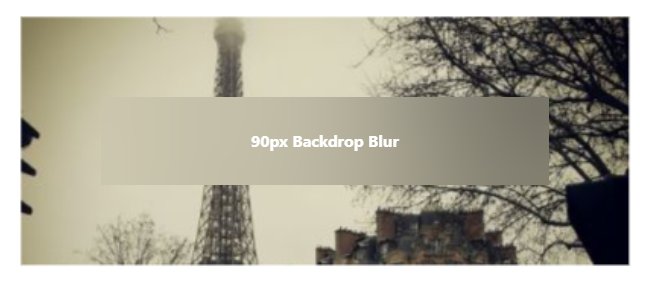
Creating a “Frosted Glass” Effect
The “frosted glass” effect is a popular design trend that involves creating a semi-transparent, blurred background. This effect can add a touch of sophistication and elegance to your website:
    .frosted-glass {
        background-color: rgba(255, 255, 255, 0.1); /* Semi-transparent white */
        backdrop-filter: blur(10px); /* Apply blur to the background */
        padding: 20px;
        border-radius: 10px;
    }
In this example, the backdrop-filter: blur(10px) property is used to blur the content behind the .frosted-glass element. This creates the illusion of looking through frosted glass. Note that backdrop-filter might not be supported in all older browsers, so consider providing a fallback.
Blurring Images for Privacy
Blurring can also be used to protect sensitive information in images. For example, you might want to blur faces in a photo to protect the privacy of individuals:
    .privacy-blur {
        filter: blur(8px);
    }
Apply this class to the image or the specific area you want to blur to obscure the details. This is particularly useful for websites that display user-generated content or sensitive information.
Common Mistakes to Avoid
While blurring images with CSS is relatively straightforward, there are some common mistakes to avoid:
- Over-Blurring: Blurring an image too much can make it unrecognizable and detract from the overall design. Use a blur radius that enhances the image without obscuring its details.
- Ignoring Performance: Applying blur to too many images or using excessively large blur radii can negatively impact website performance. Optimize your images and use hardware acceleration to mitigate this.
- Forgetting Cross-Browser Compatibility: Ensure that your CSS is compatible with older browsers by using vendor prefixes or alternative solutions.
- Neglecting Accessibility: Consider the impact of blurring on users with visual impairments. Provide alternative text or descriptions for blurred images to ensure accessibility.
Conclusion
Blurring images with CSS is a powerful technique that can significantly enhance your website’s visual appeal and user experience. By understanding the filter: blur() property, experimenting with different blur radii, and considering advanced techniques like combining filters and animating the blur effect, you can create stunning and engaging visual designs.
Remember to optimize your images for performance, ensure cross-browser compatibility, and consider accessibility when implementing blur effects. With careful planning and execution, you can master the art of image blurring with CSS and elevate your web design to the next level.
