How to Make a Box and Whisker Plot: A Step-by-Step Guide
Box and whisker plots, also known as box plots, are powerful visual tools for displaying the distribution and spread of a dataset. They're particularly useful for comparing multiple datasets at a glance. This guide will walk you through creating a box and whisker plot, from understanding the data to interpreting the final visualization.
Understanding the Components of a Box and Whisker Plot
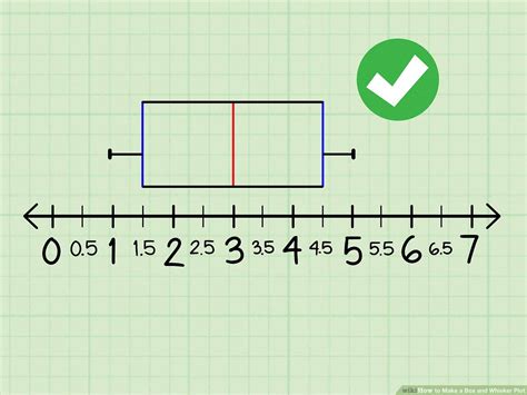
Before diving into the creation process, let's understand what each part of a box plot represents:
- Median: The middle value of the dataset. This is represented by the line inside the box.
- First Quartile (Q1): The value that separates the bottom 25% of the data from the top 75%. This is the left edge of the box.
- Third Quartile (Q3): The value that separates the bottom 75% of the data from the top 25%. This is the right edge of the box.
- Interquartile Range (IQR): The difference between Q3 and Q1 (Q3 - Q1). This represents the spread of the middle 50% of the data.
- Whiskers: The lines extending from the box. They typically extend to the minimum and maximum values within 1.5 times the IQR from the box edges. Values outside this range are considered outliers.
- Outliers: Data points that fall outside the whiskers. These are often represented by individual points or dots.
Step-by-Step Guide to Creating a Box and Whisker Plot
Creating a box plot involves several steps, which we'll break down for clarity. We'll use a simple example dataset to illustrate the process.
Example Dataset: Let's say we have the following test scores: 60, 70, 75, 80, 85, 90, 95, 100.
Step 1: Sort the Data
First, arrange your data in ascending order: 60, 70, 75, 80, 85, 90, 95, 100
Step 2: Find the Median
The median is the middle value. Since we have an even number of data points (8), the median is the average of the two middle values: (80 + 85) / 2 = 82.5
Step 3: Find the First and Third Quartiles
- Q1: The median of the lower half of the data (60, 70, 75, 80). Q1 = (70 + 75) / 2 = 72.5
- Q3: The median of the upper half of the data (85, 90, 95, 100). Q3 = (90 + 95) / 2 = 92.5
Step 4: Calculate the Interquartile Range (IQR)
IQR = Q3 - Q1 = 92.5 - 72.5 = 20
Step 5: Determine the Whiskers
- Lower Whisker: The smallest value within 1.5 * IQR below Q1. 1.5 * 20 = 30. 72.5 - 30 = 42.5. The lowest value in our dataset greater than 42.5 is 60. Therefore, the lower whisker extends to 60.
- Upper Whisker: The largest value within 1.5 * IQR above Q3. 92.5 + 30 = 122.5. The highest value in our dataset lower than 122.5 is 100. Therefore, the upper whisker extends to 100.
Step 6: Identify Outliers (if any)
In our example, there are no outliers, as all values fall within the range defined by the whiskers.
Step 7: Draw the Box and Whisker Plot
Now, you can draw the box plot using the values calculated above. The box extends from Q1 (72.5) to Q3 (92.5), with the median (82.5) marked as a line inside the box. The whiskers extend to 60 and 100.
Using Software for Box Plot Creation
While manual calculation is helpful for understanding the process, software like Excel, R, Python (with libraries like Matplotlib or Seaborn), and many other statistical packages can easily create box plots. These tools automate the calculations and provide visually appealing results.
Interpreting the Box and Whisker Plot
Once created, a box and whisker plot offers a quick overview of your data's distribution:
- Skewness: A longer whisker on one side suggests skewness in the data.
- Spread: The IQR indicates the data's spread. A larger IQR suggests greater variability.
- Outliers: Outliers highlight potential anomalies or unusual data points requiring further investigation.
- Comparison: Multiple box plots side-by-side allow for easy comparison of different datasets.
By following these steps and leveraging available software, you can effectively create and interpret box and whisker plots to gain valuable insights from your data. Remember to always label your axes and provide a clear title for easy understanding.
